Week 2: Learning Shading & Depth
This week I will be learning the basics of shading and depth. I have slightly altered my plan as I will learn basic shading with graphite and then with charcoal. Shading and depth are what makes the illusion of structure and skin within a portrait. For example, to create the look of a cheekbone and nose bridge, being skilled in depth and shading is necessary. The shading around these areas are shadows which are key in depicting volume. To practice shading and depth I will create spheres in which I will practice drawing gradients. As I mentioned earlier, I will be comparing graphite and charcoal. Charcoal gives a darker, richer matte finish whereas graphite is reflective and metallic, making charcoal slightly better for portraits. As I’ve never worked with charcoal before, shading using the product may be harder than I anticipate. By experimenting with graphite and charcoal through shading, I will be able to select the product which will work best for my full portraits.
Here I have shown my progress:
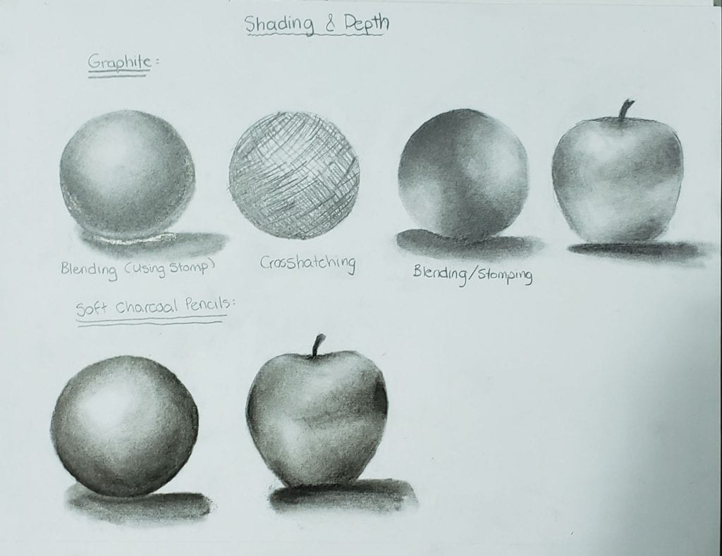
In my sketch above, one technique I used was crosshatching. Originally crosshatching was not a technique I was going to experiment with. Although after trying crosshatching, this technique was much harder than I anticipated. To perfect crosshatching, I would need to make multiple attempts and great effort into learning the specifics. However, blending was straightforward and carefree. I conclude this is to the fact that I have blended using a blending stomp frequently over the years, making blending easier. When blending using the stomp, I found that graphite took much more effort and time than with charcoal. Charcoal is more chalk-like which may have made it easier to blend
By doing this activity, I have learned a few main differences between graphite and charcoal. Graphite, as I had expected, was very metallic, reflective, and had lower pigmentation. On the other hand, charcoal was highly pigmented, of a chalk-like texture, and was much easier to blend than graphite. In conclusion, charcoal would be a better option for my portraits whereas graphite could be used for lighter areas of low contrast.
![]() zahraott22 • December 7, 2022
zahraott22 • December 7, 2022